The Freedom Principle

This last weekend I ran away to Philadelphia and saw at the ICA an exhibition, The Freedom Principle: Experiments in Art and Music 1965- now.

Largely about the Chicago art and music scene in the 60’s- from 2 groups formed at the time the AACM and AfriCOBRA (African Commune of Bad Relevant Artists). There I saw Revolutionary, a painting of Angela Davis, in a suit created by the artist himself, Wadsworth Jarrell.

I had heard about Jarrell a while ago, exploring text artists online, and so this was a fantastic and unexpected opportunity to see a couple of his paintings in person.

download.jpeg

liberation soldiers- w jarrell.jpg

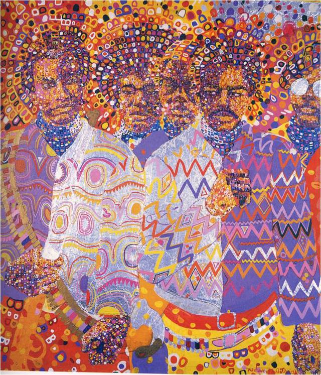
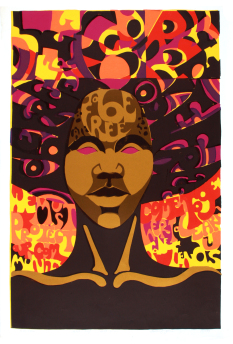
Wadsworth Jarrell- Revolutionary, Liberation Soldiers.

As part of AfriCOBRA, text was folded into artists work to form a manifesto of sorts, slogans that could not be misinterpreted, at the time, or in the future, and although that makes them definitely  of that period of time, it was also a way for a positive message to be permanently brought into history, tattooed into time.

Jae Jarrell, on talking about AfriCOBRA noted, “And that’s, that’s something that is an advantage of working in a group, and having honed our own language—what we want, directing you what to see, not leaving ourselves, our work, at the mercies of the critics, to interpret. We clearly wrote on the canvases and garments and tapestries, exactly what we wanted you to know, and say. And that can be a hindrance in a way, because critics are held to the posture that we set forth, but nonetheless, it holds true. You see the stuff later; you can’t read anything into it but what’s in it. And I think it’s strong.”*

Not in the exhibition, but also heavily featuring lettering in their work, are fellow AfriCOBRA members Barbara Jones-Hogu, and Gerald Williams **

gerald williams.jpgjones-hogu-to-be-free.jpgbarbara hogu jones.jpgstevens-uhuru-lg-l.jpg

Carolyn Mims Lawrence.jpg

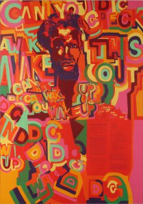
Gerald Williams- Wake Up

Barbara Jones-Hogu- To Be Free ( Know the Past, Prepare for the Future), 2.

Nelson Stevens- Uhuru

Caroline Mims- Uphold your Men

“Each artist had his or her own way of presenting the lettering, resolving their lettering into the artwork. That was part of our principles: introducing statements into the art.” – Wadsworth Jarrell*, and this was definitely true of Jones- Hogu and Williams, those statements were easily read, while others were more covert, “you might not ever see some of the lettering and statements that’s in the art.” *

Jeff Donaldson was a co-founder of AfriCOBRA,  and contributed to Chicago’s famous War of Respect with the other AfriCOBRA members, so I feel I should mention his work,  although he appears to be one of the few without lettering. Although his work uses the frenetic energy created by AfriCOBRA,  he chose to use references and symbols rather than actual text. He described their style as “high energy colour, rhythmic linear effects, flat patterning, form-filled composition and picture plane compartmentalization [,]” which differs from Wadsworth and Jae Jarrell’s manifesto and his work demonstrates it- following a more mosaic style, that Jarrell’s encapsulates, using figurative rather than textual references.
jampact.jpg

Jeff Donaldson- JamPact JelliTite (for Jamila)


* https://never-the-same.org/interviews/wadsworth-and-jae-jarrell/

** https://never-the-same.org/interviews/gerald-williams/ and

For more info see:

The Freedom Principle at the ICA Philadephia- until March 2017

http://icaphila.org/exhibitions/8015/the-freedom-principle-experiments-in-art-and-music-1965-to-now

also

https://www.theguardian.com/news/2004/mar/13/guardianobituaries.artsobituaries

https://www.theguardian.com/cities/2014/dec/08/chicago-wall-of-respect-collective-ownership-organisation-black-american-culture

http://africanah.org/wadsworth-jarrell/

https://never-the-same.org/interviews/barbara-jones-hogu/

https://arts.uchicago.edu/logan-center/logan-center-exhibitions/archive/africobra-philosophy

identity.jpg

Wadsworth Jarrell- Identity.

Posted in art | Leave a comment

Stephen Powers


Stephen Powers is a NYC based artist that I found about from seeing ‘A Love Letter for you‘ in Philadelphia. He is known as a graffiti and street artist, that has since also completed ‘A Love Letter to Syracuse’ (2010) and ‘A Love Letter to Brooklyn’ (2011)- in a square block in Brooklyn, Tokyo (2014) and Baltimore (2014) with his crew, ICY. “The crew has done murals in 14 cities total since 2003, with officials generally approaching ICY with funding, public support, and political backing[.]”*****

download (1)

I recently saw his exhibition at the Brooklyn Museum, Coney Island is still a Dreamland (To a Seagull) and discovered the long history Powers has had working with and inspired by Coney Island.

“There I found a middle ground between the graffiti I spoke fluently and the painting language I could speak only well enough to order a beer. So I ordered a beer and made paintings that looked like Coney Island signage, except I stripped out the commercial and inlaid emotional content. The resulting art was visually clear and direct, unflinchingly confronting the complexities of love and life in a way I avoided in my everyday living.”******

In 2003, after seeing old school Coney Island signs being replaced with cheap vinyl versions, he volunteered to paint the Eldorado Bumper car signs, at which point he was invited to do more. He ended up inviting 20 emerging artists and local business’ to work together to create images as workable signage, and also exhibits in themselves. The Collective was called the Dreamland Artists Club, and featured artist such as Gents of Desire, Rita Ackermann, Ryan McGinness, SSUR and well as Matt Wright, an unemployed Brooklyn sign painter. The project was so successful The Dreamland Artists Club remounted another sign painting in 2004 and 2005 with different artist, all through Creative Time.

Work by Stephen Powers, Bruno Peinado, Verdana Jain, Swoon.

In 2008, he was commissioned to create a piece by Coney Island  USA in a space that he said reminded him of a interrogation room, he work he created became a piece exploring waterboarding. And although he has said it was not politically motivated, ” ‘it doesn’t take a great leap of the imagination to look in there and say: ‘That’s really what’s going on? That’s crazy.’ ”* “The fact that it took place near roller coasters and cotton candy sends an important message: We here can engage in frivolity and fun at a time when in our name this is happening to people somewhere else.”**

This summer, as part of Coney Art Walls, a small closed off area within Coney, featuring street art and food trucks,and curated by Joseph Sitt and Jeffrey Deitch of Deitch Projects, he exhibited a wall of signage, similar in vein to the exhibition at Brooklyn Museum. Some of these are repeats of signs created for the NYC Summer Streets program 2015.

It’s interesting to see his work as a series of collaged signs, rather than the large scale mural pieces that compose “Love Letters”, as the overlaying messages and subjects of the signs create a denser and richer thematic. The walls of signs within the museum reach almost two stories tall and in that way are an sensory overload of the constant messages we are bombarded with through advertising,  as well as messages we internalize ourselves in the city on a daily basis. These signs use the commerce of Coney Island as a starting point, but end as a meditation on modern life. “In his work, he uses logotypes that have a superficially commercial look, combining them with his own text to create enigmatic meanings that deliver an emotional punch.”***

The exhibition also features works by Justin Green, Matt Wright, Mike Levy, Dan Murphy, Mike Langley, Mimi Gross, Alexis Ross, Sean Barton, Eric Davis, and Tim Curtis. Powers has described their process of collaborating together as “really focused and proceeded in a really orderly direction from the start, but then it was all improvised. For us the best signs are painted one letter at a time, without really any forethought. Just in the moment.”****

tumblr_o3w45d1jr61s3x0n6o5_1280

*http://www.nytimes.com/2008/08/06/arts/design/06wate.html?_r=2

**http://www.washingtonpost.com/wp-dyn/content/article/2008/08/16/AR2008081602071.html

***https://www.brooklynmuseum.org/exhibitions/stephen_powers_coney_island

****http://www.coolhunting.com/culture/brooklyn-museum-coney-island-stephen-espo-powers

*****http://www.citylab.com/design/2015/01/how-to-paint-a-love-letter-to-a-city/384535/

******https://www.brainpickings.org/2014/03/10/a-love-letter-to-the-city-steve-powers/

For more on The Dreamland Artists Club

For more on Stephen Powers

Stephen Powers at the Brooklyn Museum until August 21st.

tumblr_o3w45d1jr61s3x0n6o8_1280

Posted in art | 1 Comment

A rich mix: poetry/art from Puerto Rico

While in Puerto Rico for a week and wondering around Santurce around both the Museo de Arte de Puerto Rico and also looking for street art (some of which sadly no longer exists), I was struck with the large use of text and art- or more specifically poetry and art. The artists often using another’s eloquent words to illustrate a point.

I did a little research, and found Puerto Rico, actually has a rich history of doing this very thing, largely to a political end. The most famous of which is Lorenzo Homar’s Unicorn on the Island. The woodcut was made by him, and the poetry by a contemporary Thomas Blanco, a beautiful ode to the island. Homar inspired the next generation of Puerto Ricans’s through the many schools he taught at (Graphics Studio of the Graphic Art Division of Puerto Rico’s Department of Community Education (DivEdCo), Institute’s Graphic Arts Workshop, and later his own studio) after studying print making, drawing and typography at Pratt.

homar found april 3-thumb-450x202-21873.jpg

The Unicorn on the Island, Lorenzo Homar

  “Wet Breeze, magic coves, secret brushwoods

  And the Unicorn raises in the scrubland

 ready to jailbreak, alert and tense”5

It’s interesting because although it’s something I talked about in my last blog post, it’s not altogether that common.  Being inspired by poetry and making images inspired by poets long dead, yes,  but  working with contemporaries is not so common.

homar found april2-thumb-450x303-21876.jpg

El Maestro, Lorenzo Homar

So here’s a little love letter to the many artists of Puerto Rico and Puerto Rican descent, working with text and art. Sadly not as much infomation or images as I’d like to show on these artists is available online, but here are some tips of icebergs.

Adal Maldonado, who reminded me immediately of Duane Michaels ( and who credits him as huge inspiration), who works as a photographer and video artist, in a very surreal sense. He uses text in a very narrative sense, much like Michaels.

Screen Shot 2016-06-19 at 10.07.24 PM

Forgotten memories, Adal Maldonaldo

                         Falling Eyelids, Adal Maldonaldo

Jose Alicia, who was mentored by Homar, and was his assistant for years.” His prints often include literary texts or other written words, and they deal with social and historical subjects presented within a figurative tradition.”1

Screen Shot 2016-06-19 at 10.35.02 PM

Screen Shot 2016-06-19 at 10.38.06 PM

Juan Sanchez is a Nuyorican ( New York Puerto Rican) born artist, working more in painting than traditional printmaking, and his canon has a frenetic energy, that comes from the layering of lithograph, collage and scribbles, but still incorporating text into it, albeit in much looser form.

Sánchez specifically became known for producing brightly hued mixed media canvases that addressed issues of Puerto Rican life in the U.S. and on the island. Of his work, critic Lucy Lippard once wrote: “it teaches us new ways of seeing what surrounds us.”2

Angel de Vieques &  La Lucha Continua,   Juan Sanchez

“Frenetic overall patterns spliced with poignant documentary images and poetry convey generous revelry: a celebration of future possibilities.”3 The paintings deal with images, and symbols that could be found as easily on the street as in a musuem, “Grafitti art and culture are designs of symbols and identity on streets […] the inspiration behind making the work [is] to connect with people in a very direct and personal way, transcending formal barriers to find the emotive experience.””

Screen Shot 2016-06-19 at 10.58.16 PM

Para Carmen Maria Colon, Juan Sanchez

“In this print Sánchez quotes Felipe Luciano, the poet and cofounder of the New York branch of the Young Lords, a Puerto Rican youth activist group founded in 1969[]”4
Lastly, a piece of street art that sadly no longer exists (I did walk around the block 3 times just to check everywhere). It was the first piece of text and art together I saw when researching San Juan and I was determined to find it.
thumbs_img_1412.jpg
The piece, by  Alexis Dias,  has a single line of poetry underneath it, by Julia de Burgos.
Dejarse vencer por la vida, es peor que dejarse vencer por la muerte”
Being overcome by life is worst than being overcome by death.

1. Museo de Arte de Puerto Rico, Jose Alicia

2.Wikipedia on Juan Sanchez

3.From MOMA PS1 exhibition on Juan Sanchez RICANSTRUCTIONS

4.From the Smithsonian Exhibition, Our America: The Latino Present in Latino Art

5. Translation by RB Gomez


More infomation on

The Unicorn, by Lorenzo Homar

Julia de Burgos

Alexis Diaz

Adal Maldonado

Juan Sanchez

Hunter College also now has a great collection of Puerto Rican Prints. See here for details.

And here for the Julio de Burgos Center in NYC


Pictures courtesy of

Museo De Arte de Puerto Rico

Joan Mitchell Foundation – see for an interview w Juan Sanchez

Library of Congress


Posted in art, collage, poetry, text-based artists | Tagged , , , , , , , , , , , , , , , , , , , , | Leave a comment

A Collaboration

ISRELL-2016.0002-Different-Kind-of-Star-796x420.jpg

la-et-cm-alex-israel-bret-easton-ellis-billboards-gagosian-20160315.jpgSadly now over, the Gagosian in LA, recently held a exhibition that was collaboration between an artist Alex Israel and Bret Eastern Ellis. Ellis is best known for his novels Less Than Zero, American Psycho and The Rules of Attraction, and Israel, a younger L.A artist, best know his project ‘As it LAys’- his Warholian ‘screen test’-like interviews of passé L.A celebrities.  ******  For a great review of the project see here.

Although Israel cites Los Angeles for having a “long tradition of text-based art in LA, from John Baldessari to Raymond Pettibon and Barbara Kruger […]”  collaborations between artists and writers seems to be rarer, and as ” a daunting thing to take part in that tradition, [he] asked Bret to collaborate.”*

The result is a series of witty catchisms over stock photography of the city, nevertheless  accurately portraying the inhabitants of a city that is one to itself. As seen as a commentary on Los Angeles’ shallowness itself, spot on, despite a scathing review from the Los Angeles Times. **  “Since Israel and Ellis are both natives who presumably know LA is richer and far more nuanced than the caricature they present, […]  maybe this is an ironic, meta commentary on the people who hold these beliefs about LA?” ***

For as someone who has lived in the Los Angeles on and off for 20 years, diving in and out of the city and seeing it with fresh eyes each time, these comments can only be a sly commentary on how the rest of the world sees Los Angeles, less biting than Neil LaBute’s The Money Shot, but if you know Los Angeles well, achieving the same end. The two artists, however, seem to disagree on the end game that the paintings present, which I think is part of the friction of the text and images themselves, a discrepancy that becomes a commentary in itself.

“Ellis has revealed that his disdain for the city has settled over the years, and that the show is actually more of a twisted tribute. “I started writing sentences I thought were evocative, an extension of the characters I usually write about,” he told The Guardian. “They were dark at first, but Alex’s sensibility would merge with mine and they changed.”****P1080535-copie-820x550.jpg

He has said ” “[He] believe[s] that, yes, people come out here to reinvent themselves, and they ultimately do to a degree, but I also think that L.A. kind of forces you to become the person you really are,” he said. “There’s just something about the geography and the harshness of the business — you can become this other person that everyone is yearning to be, but it mostly doesn’t work out that way. Ultimately, you have to face the facts. I think these people [in the paintings] are in transit in a way. They are in these two lives, but they’re in transit, and they’re going to land someplace else.” *****

images.jpg

 Ellis’ darker side of what he has witnessed in years of living in Los Angeles, a side that he admits he’s drawn to, and is omnipresent in LA, set to Israel’s optimistist cliched images of Los Angeles present in some way a truer portrait of the city, not necessarily  a chopped-off ear, in amongst the manicured grass, as in Blue Velvet, but revealing the vapidness within the inhabitants of the city, that manage to live double lives, without ever finding, or desiring, a deeper layer.

P1080531-copie-820x550.jpg

Israel has argued that the images are not ironic or playful, much as he has argued his screen shots are are not a mockery of celebrities living in the past.****** One wonders whether this is really his point of view, or simply a white-washed position, in order for him to continue to make more work untainted by the label of satirist, biting the hand that feeds him.

Indeed, a comment on Israel’s Interviews, ‘As it LAys’, “The project reveals several variations on the theme of self-deception; perhaps with age this is something we all fall prey to. In the words of the great 17th-century French thinker François de la Rochefoucauld, “One is never so easily fooled as when one thinks one is fooling others.””****** argues Israel is more aware of his intentions in his artwork than he lets on.

Either way the images portray a witty self portrait of a city drowning in it’s own reflective surface.


All images courtesy:

http://www.gagosian.com/exhibitions/alex-israel–bret-easton-ellis–february-25-2016

For more of the work of Alex Israel see www.Asitlays.com

*http://www.theguardian.com/artanddesign/2016/mar/01/bret-easton-ellis-alex-israel-california-uber-alles-gagosian-gallery

**http://www.latimes.com/entertainment/arts/la-et-cm-alex-israel-bret-easton-ellis-billboards-gagosian-20160315-story.html

***http://www.scpr.org/programs/offramp/2016/03/23/47450/critic-alex-israel-brett-easton-ellis-billboard-sh/

****http://www.dazeddigital.com/artsandculture/article/30165/1/bret-easton-ellis-rips-into-la-with-new-art-exhibition

*****http://www.wmagazine.com/culture/2016/03/bret-easton-ellis-alex-israel-gagosian-gallery-beverly-hills/photos/

******http://observer.com/2012/04/who-is-alex-israel-and-why-should-i-care/


38088ef3c670b4a822014044de37df9f.png


Posted in art, photography, text-based artists | Tagged , , , , , , , , | Leave a comment

#humanerror

I came across Victoria Siegel a little while ago on my new favourite art and design site, www.thisiscolassal.com, and although initially I came across pictures of her reflected mirror-like landscapes, a little investigating led me to her #humanerror series, which hit all my text and images happy buttons.

Self-described as “a series of nostalgic polaroids that depict the broken heart as computerized error that may or may not be restored in a few mouse clicks[,]”  the witty computer error boxes which overlay the beautiful and often sad images,  make human emotion another task to click through before ending the work day. The images they are set to, though, betray the words’ clinical and technical tasks.

We are a culture fascinated with how science informs love and heartbreak, with countless books written about the chemical reactions that take place in our brains when heart break happens, with endless research into the idea of pills that can make us forget bad memories (this is the latest), culminating in the fascinating conclusion that we should just take 2 aspirin like any other kind of pain. And this is yet another solution- technology. If we can have therapists on a call through or telephones, can’t we just hook up our emotional circuits to a computer and have them rebooted? And drag our feelings to the trash? Her pieces are funny admission that although Silicone Valley has managed to develop an app for everything their mothers are not around to do for them,  we still haven’t worked out how to overcome our emotions in a nice easy format.

victoria-siemer-human-error-emotional-computer-notifications-designboom-02.jpg


For more see

http://witchoria.com

@witchtoria on Instagram 

Images from:

http://beautifuldecay.com/2014/04/08/victoria-siemer-transforms-human-experience-computerized-error-messages/

https://russoturistooa.wordpress.com/2015/05/25/victoria-siemer-a-minimalist-revolution/

http://www.designboom.com/art/victoria-siemer-emotional-macintosh-notifications-07-02-2015/


Posted in art | Leave a comment

When in Ice Castles…

IMG_4143.jpg

IMG_4126.jpgWhen in Ice Castles, be sure to dress appropriately.

Or carry an extra sequin corset in your purse, just in case.

I had made the corset as a commission for a photoshoot (the dress is vintage), with the theme of the Disney film Frozen, photographed in Prospect Park last year, and although the pictures were good, it was just very…. green, spring-like in fact. So when I had the opportunity to go to real ice hotel- Hotel de Glace in Quebec, I packed some extra things in my case. I wasn’t terribly original in this idea- Disney themselves used the site as a press junket for Frozen, when it first opened. Not that it stopped me.FullSizeRender.jpgIMG_4087.jpg

The Hotel de Glace is an amazing building.  Conceived to only exist from January to the end of March, ice sculptures and artisans create about 10 rooms every 2 weeks to add to the hotel- in total taking about 50 people in a month and a half. They build the ice structure around a metal frame using a special mixture of ice and snow created for the humidity. The walls are then sculptured into, beds, tables, chairs are all sculptured and placed in the rooms. It’s spectacular how much work goes into this.

Every year the hotel is left to melt at the end of March and then rebuilt, as a completely different design in the January that follows.

So we walked round snatching pictures before the last 2 weeks, of rooms that would never exist again. While the Psychedelic Furs played, un-ironically, on the bar speakers.

http://www.hoteldeglace-canada.com/ for more info.


IMG_4082.jpg  IMG_4107.jpg

IMG_4089.jpg


Posted in art, photography | Tagged , , , , | Leave a comment

It’s all storms and hurricanes

“Do the times make the artist or does the artist make the times? Both at different times are correct—I guess. Some times got Shakespeare others got Pope, one period got Lady Murasaki and Sei Shonagon at the same time. What can you say about a period that got stuck with . . . me. I really wanted to be great but the times didn’t need it of me. The times demanded my failure. I wanted a nice apartment to hang my pictures in, a drawing room somewhere above the din, and found the war was going on in my brain. I hitchhiked up Olympus and it turned out to be a volcano. How can I know what’s politically correct? I didn’t have time to stop and think whether what I was doing was right; I had to make my history quick because there would be no future, merely a gossamer world blown about on the zeitgeist, till zeitgeist, the wind of the times, is blasted away by kamikaze, the wind of God.”*

Rene Ricard- Art Forum Nov 1982

Reading a magazine last week, I came across an artist I had never heard of. Probably because he’s most famous as a art critic rather than an artist. Self described as a poet and movie star* Rene Ricard joined Warhol’s factory with small parts in “Chelsea Girls” and “Kitchen”, after pouring over one Warhol’s flower paintings at the ICA in Boston. As he tells it, “To support myself as a kid, I was a model at art schools around Boston. When I stopped working at 2 P.M., I’d walk up Newbury Steet, which is where the art galleries were. One day, I was at a gallery run by a friend and she said, “Rene, there’s something you’ve got to see over at the Institute of Contemporary Art.” I walked in, and there was a painting by Andy Warhol, the flower painting. It was orange, yellow, fuchsia, red, and green, and it looked enormous. Paintings weren’t that big at that time — this was ’64 — and, while looking at it, I evolved a theory about it. Andy had made a painting that was essentially flawless, but it was an actual painting. So he had this green background, and orange, yellow, fuchsia spots which were kind of pushing forward — they looked like they popped. I had never seen anything like it. I was in a trance. The guard tapped me on the shoulder and said, “Excuse me, but the gallery’s been closed half an hour.” I completely planned out my life looking at that painting. **

As an art critic and essayist he was instrumental in the starting the careers of Julian Schnabel, Keith Haring and Jean-Michel Basquiat.  “As a critic, he only wrote a bare handful of pieces, but they were major events.”****

His life was decadent and self- destructive, happily squandering away a $10,000 gallery advance in a day at the Russian Tea Room and on Jean-Paul Gaultier underwear, which he washed, and left drying in the sun where it was stolen. By nightfall he was penniless and at a homeless shelter. ***

“Just as his life could vacillate between glory and squalor, his poems- which he eventually took to painting over his own or others’ canvases- are all heart-break and defiance, ruined love and declarations of an independence he insisted on even when he sat at the best tables.”****

tumblr_n31t9jq1Is1twhceuo1_500

images-12 Bkj-RVfIIAE-I4d.jpg_large RR_AvailableWorks_June2012_12

“I’ve seen beautiful things. I’ve been around so many years; how did I get to be so old. I’m pretty beat, and scarred like a whale from a million harpoons, but I’m still in the swim, y’all, I’m still out there. Oh I’ve seen so many waves. You ride it and when it crests you keep your balance or you get washed up. So I keep in the swim, go with the current, try to keep a sense of where I can land, sometimes swimming against the tide when I feel it’s getting too far out until one day I’ll drown or get stranded on the beach.”*

* from a biography in Art Forum

https://artforum.com/inprint/issue=198209&id=35549

** From Interview Magazine

http://www.interviewmagazine.com/culture/factory-workers-warholites-remember-rene-ricard/#_

*** from the Brooklyn Rail Memoriam by Raymond Foye

http://www.brooklynrail.org/2014/12/criticspage/rene-ricard-dec14

**** New York Times Magazine, Dec 28th, by Luc Sante

http://www.nytimes.com/2014/02/07/arts/rene-ricard-art-arbiter-with-wildean-wit-dies-at-67.html?_r=0

For more there’s a really great interview/conversation with him here:

http://artoridiocy.blogspot.com/2014/04/rene-ricard.html

Foye-web15

Foye-web4

Posted in art | Tagged , , , , , , , , , | Leave a comment

Word Play

I just discovered Kate Tempest. And even though rap isn’t normally my style, I’m kind of in love with her lyrics. Her bluntness. And frankly the skill of those rhymes.

I also discovered the video for Give from her band The Sound of Rum,  and I love the text… so here you are. You’re welcome.

More you ask?

Well, start here-

with The Brand New Ancients, performed at Battersea Art Center, which won the Ted Hughes Innovation in Poetry Award, and then you’re on your own.

Videos from:

http://katetempest.co.uk

Foe more info on Kate Tempest

see http://www.theguardian.com/books/2014/oct/04/kate-tempest-rapping-changed-my-life

See http://en.wikipedia.org/wiki/Kate_Tempest


Featured image courtesy The Sunday Times

Posted in art | Tagged , , , , , | Leave a comment

On Language

A little while ago I came across an interview with Rosalee Goldberg, queen of performance art, she was talking about text and poetry, and the audience that witness both, “some love language in itself, and some the written word. Theres’ a language that is read aloud and there’s a language that’s listened to. There’s language in the mouth. Language that’ is tasted. language on a wall, language in space […]”.

For some reason I’ve been having problems articulating what I what to say lately and so I thought it might be interesting to write about language. This quote alone made me want to add to the lists of types of languages there might be.
Firstly, it made me think of Tim Etchells, from the performance group Forced Entertainment, who wrote about his process, in the essay, On Performance Writing. * He too, has a list of texts (which in this context could be interchangeable with language). His list starts with,
” 1. A text to be whispered by the bedside of a sleeping child
2. A text to be yelled aloud by a single performer in a car park at dawn
3. A text to be left on the ansaphone of strangers.
4. A text to be spoken while fucking secretly the partner of a good friend
5. A text for a megaphone
6. A text to be used as a weapon “
The list of texts continues, each in a way, a recipe for a new performance, a new way of creating, through language.
 Forced Entertinment’s performance work in general uses language to confuse or make the audience define their own context for what they are experiencing- and it is often very contradictory. For example, in Emmanuel Enchanted every performer has multiple signs announcing their characters, such as A DRUNK MAN SHOUTING AT THE MOON, QUEEN OF NOTHING, LINDA ( OUT OF LUCK), or simply LIAR. Part of the performance was “the act of arranging and rearranging units of infomation, be they textual, visual or spatial so that new patterns, implied narratives and meanings [could] emerge,”* the signs clashing, or having nothing to do with the language the performers were saying. Language that is slippery, Language which contradicts itself. 
Their work has a quality of secret diary entries that are said aloud, particularly in Club of No Regrets, in which one performer is lost in the woods, talking to herself- language not meant to be heard by another human being- there’s a confessional quality to it . Another two performers are bound and gagged, while interrogated, and a series of telegrams. Language that only emerges under duress.
It also made me think of Mel Boucher, still currently at the Jewish Museum in New York. His paintings are thesaurus entries, language that’s in pieces and needs to be put together to be fully understood. 2014-08-02 16.38.45
He also has a series of ‘portraits’ made of compositions of text- visual text.
His one of Eva Hesse takes the structure of one of her words and uses it to create a visual framework for the language.  Language that is defined as a composition, Language in a visual cage.
Unknown    12
This in turn lead me to look at the Ruth and Martin Sack near archive for visual and concrete poetry.
How do you define visual and concrete poetry?
Wikipedia, says ” Visual poetry is poetry or art in which the visual arrangement of text, images and symbols is important in conveying the intended effect of the work. Confusingly, it is sometimes referred to as concrete poetry, a term that predates visual poetry.”** Often it’s referred to as text- based art.
In this archive, I came across Jeremy Adler, whose words are truly Language as painting, language as another layer, another varnish, another wash of colour, that adds texture, but not necessarily understanding.
57db327b12ca3e827bc83d5f70e0621e
Language torn, damaged. Language as a fragment. Language to be whispered in the wind.
I realzised that is something I’m quite interested in my own work, language as a clueLanguage as a series of dots waiting to be connected. Language that is mutable depending on the audience-  that means something to one person and completely something else to another.
Language that you follow like marked trees up a mountain.
Language where the signifier might not create the sign, undependable language.
This idea reminds me of a book, The Raw Shark Texts by Stephan Hall, a novel in which the protagonist is forced to somehow turn a bottle filled with scraps of paper, on which the word ‘water’ is written on each, into water to be able to swim in it.
Language that you have to believe in with every ounce of your being for it to become true. Language you can swim in.
Isn’t that Salmon Rushdie’s Sea of stories? It was one of my favorite books as a child. Salty tales, morals, fables, myths, fairytales, old wives stories, all muddling in the vastness of the ocean of the stream of stories,
“… it was made up of a thousand thousand thousand and one … currents, each one a different colour, weaving in and out of one another like a liquid tapestry of breathtaking complexity. [Each] coloured strand … contained a single tale. [The Ocean held] all the stories that had ever been told and many that were still in the process of being invented. The Ocean of the Stream of Stories was in fact the biggest library in the universe.”***
 Language that drips through your fingers, language to swim in, language that nourishes.
And then there’s always those words that colour everything around them, or those words so ripe they burst into flavour and contaminate everything around them. Language as a pigment, a soothing elixir. The greats- Shakespeare, T.S Elliot surely are elixirs, Roselee Goldberg’s Language to be tasted.
I think I’m fascinated because I sometimes lack the ability to create meaning out of the string of words that foams at my mouth.  Language like a pinned butterfly, that never really wanted to be caught in the first place.  We dubbed them ‘word days’ in college. If people knew me well, they could figure out the dots, connect the thoughts. Because sometimes it was a more painful process than not. They still occur when I’m stressed, tired, or just feeling nervous. I just live with them. And my sign? THE GIRL WHO COULDN’T SAY WHAT SHE WAS FEELING.
See Language as a confession. Language that paralyzes.
* From Certain Fragments by Tim Etchells
*** pg. 71. Haroun and The Sea of Stories by Salman Rushdie
for more on Rosalee Goldberg see
Posted in Uncategorized | Tagged , , , , , , , , , , , , | Leave a comment

Text Home.

2014-05-25 12.56.50

Once upon a time- 12 years ago- I lived in San Francisco. It was just for a year, fresh out of college, interning at a theatre, broke as all hell, living on fumes and alcohol, but it was one of my favourite years ever.

Because I loved that city. I loved how the people in San Francisco interacted with their city. London has great graffiti, edgy, unique. But San Franciscans talked back. They didn’t just paint murals but they used text. More than I’d ever seen before.

One of my favourite artists there is Rigo 23*- I used to pass this sign in Potrero Hill on the way to my wardrobe job everyday.

Screen Shot 2014-06-03 at 11.20.23 PM


Stencils on the pavement, giant billboards with  random signs and witty come-backs to the city bustling below them, the entire diary of this one girl who lived in my neighborhood who would add 3 or for lines to a lament running along the sidewalk in chalk, that would start to be erased as more and more was added, but ultimately left traces of her thoughts a full block long. And I loved that sense of talking back. Marking the streets up. Not down alleys, hidden from view, or in the tube tunnels, but arguing with the city in broad daylight, full force.

And the more I live in New York, I realize there’s also also a conversation going on.

So far I’ve discovered the Toynbee tiles in the pavement all across Midtown, tiny plaques that read “Toynbee Idea In Movie ‘2001’ Resurrect Dead on Planet Jupiter”. These tiles apparently exist in cities all over the States and South America, and appeared from the mid 80’s, as a possible reference to James Morasco concept of resurrection on Jupiter while calling a in to Larry King’s radio show in 1980. That’s explained better here,** if you’re interested.

Stencils of  “Protect your Magic”***, a project started by Fadia Kader started popping up in April. They’ve appeared with images, against Frida Kahlo, a jumping off point for the project, and with other full size murals. But I love the simplicity and truth of the slogan. Keep a little for yourself of what makes you magic, not everyone deserves it, or all of you. As a creative person it’s a lesson I’ve learnt the hard way, to keep a little of my creative fire for me, my personal projects, and my sanity. Anyway, there’s a great interview with her here.

 20140604-104033.jpg

Another piece I just saw today at the New York Times Building Lobby, was not on the street, but a different use of media and text, from artists Ben Rubin and Mark Hansen. It’s a wall of tiny monitors, which, as people are reading the news online, steals clippets from their news and broadcasts them on these screens, adding sound, and also showing the text as a single strand that weaves it way across the multiple screens, messily, intersecting with others read text, criss-crossing over it and muddying it, much as the text graffiti  above does with city streets. It’s the first time I had heard of either of these artists, but Ben Rubin, in particular seems very invested in the art using text in public spaces.

20140604-104041.jpg

Another of his projects, “And that’s the way it is”,**** in the Walter Cronkite Courtyard at The University of Texas, projects snippets from the Walter Cronkite archives, with contemporary journalism new feeds from across the country, like text clouds across the building front. It’s both beautiful and thought provoking, in their unreadable clutter.* How much information is too much? And how do we pick about the tangles texts to determine what is important?

Anyway, the point of bringing up San Francisco, was that it was these first written pieces that made me fall in love with text as art and image, and want to explore and dissect everything to do with that, so it’s funny, and also fitting to find a city so embedded 12 years later. And it’s also making me wonder if I can call this city Home.

* for more see here and http://www.artandarchitecture-sf.com/tag/rigo-23

and for an awesome map of sf murals and art see this blog http://www.artandarchitecture-sf.com/wp-content/uploads/map2.php

** sourced from http://en.wikipedia.org/wiki/Toynbee_tiles

with more pictures here

*** see here for more info www.ataleoftwobiddies.com/2014/04/protect-your-magic.html

http://www.notyouraveragebrowngirl.com/2014/05/28/do-you-protect-your-magic-meet-fadia-kader-the-face-behind-the-movement

http://instagram.com/protectyourmagic#

**** see here for more about this project and Ben Rubin

And this fantastic blog about the New York Times Building Exhibition, Artnerd.com

20140604-104049.jpg


Posted in art, public art, text-based artists, Uncategorized | Tagged , , , , , , , , , , , | Leave a comment