Belief + Doubt = Sanity

“Belief is tricky, because left to it’s own devices it can court a kind of surety, that fears doubt and destroys difference.” Barbara Krugar

I just came back from D.C, the first time I’ve been, and a nice change from NYC for 2 seconds. It didn’t resemble my collagescape from this blog months ago (which I completely forgot I’d made until I decided to write this). Strangely, it looked nothing like it and if I believed in vision boards at all, I’d be suing whomever wrote The Secret right now. It mostly just involved museums, bike rides and beers- which was great- especially seeing Barbara Krugar’s exhibition Belief + Doubt= Sanity at the Hirshhorn.*

It’s been on for a while- 2 years in fact- and will only close in December this year.

She may not show much in L.A, where she’s from (she recently resigned from MOCA’s board over the forced resignation of Paul Schimmel) but she’s honoured in a gigantic room- 6700 sq feet in fact- at the capital, and rightly so. The installation features her infamous slogans in red, white and black, each letter a foot to a foot and a half tall. A room of words so loud they ingulf you, that they are barely readable as you stand upon and amongst them. They demand puzzling over and reading out loud, slowly stringing words into sentences like pearls on a string. Everyone else in the room is doing the same, as you tumble of each other mumbling through phrases like discovering hidden keys.

The power of the words is enormous and intense, a giant brain box of jumbled slogans and questions and tidbits (as always she has a sense of humour), stark and harsh in their contrasting colors, demanding you listen and contemplate.** Too much at points, I left and came back a couple times, enjoying the feeling of being overwhelmed by language.

2014-05-10 15.32.20

“Pictures and words seem to become the rallying points for certain assumptions. There are assumptions of truth and falsity and I guess the narratives of falsity are called fictions. I replicate certain words and watch them stray from or coincide with the notions of fact and fiction.” ***

Especially in this exhibition, where the proximity to the capital, could easily put the slogans into a political context, Barbara Krugar is happy to question us on what do we really believe?  “She was intrigued by the idea of creating an exhibit that questions power in a museum with such proximity to power.” A museum, in D.C ” ‘ she was intrigued by the idea of creating an exhibit that questions power in a museum with such proximity topower. ‘It is a museum, but it is also in D.C.,’ Kruger says. ‘That brings its own information, context and baggage.'”****

2014-05-10 15.32.02
2014-05-10 15.30.07 2014-05-10 15.30.17

Another artist I was introduced to this weekend also using text as him medium is Christopher Wool. He carried on the tradition of having to step back to understand, but also really played with audience grappling for meaning in his texts, by deliberately adding spaces in odd places, or not- having words join together, so that as the audience read, they have to put in their own spaces and punctuation.

It’s the reading equivalent of trying to draw with your left hand, with a stick.

images Unknown wool_painting_x-2012-771 Chris_wool_the_harder

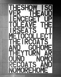
No amount of staring magically made it make sense, it’s a slow process of figuring it out, which ultimately, when you’ve got the hang of it is quite satisfying.

I don’t think all his works are this way- there are simpeliar ones- but I enjoyed these. Besides, who said it always has to be easy?

** for more images of the installation- and the texts see The Hirshhorn Musuem 

also

The Wall Street Journal’s review

*** from Bomb Magazine

**** quoted from this great article from The Washington Post

More about Christopher Wool here and here

And The Guggenheim


Posted in art, graphic design, text-based artists, Uncategorized | Tagged , , , , , , , | Leave a comment

Words vs Spectacle: Robert Montgomery

Screen Shot 2013-10-08 at 8.30.54 PM

I saw an exhibition this weekend, a collection of words in a gallery, which I discovered are more at home on the street. Robery Montogomery’s work is reaction to advertising, and he has often taken over billboards and advertising space to put up poetic text, “like ghostly lyrical interventions” + that talk about modern life.

* ATELIER PERSOL INSTALLATION shot 71

His words are quite beautiful, and are often rambles, wax lyrical on ghosts, what it means to life through late-capitalism, and preserving a sense of self within it. Inspired by Guy Debord’s writing, Roland Bathes and Baudrillard, his billboards question our love for product, and make us turn inwards instead.

Guy Debord’s writing on advertising “draws an equivalence between the role of mass media marketing in the present and the role of religions in the past.[13][14] The spread of commodity-images by the mass media, produces “waves of enthusiasm for a given product” resulting in “moments of fervent exaltation similar to the ecstasies of the convulsions and miracles of the old religious fetishism”.[15][16]” * and it is this reserve Montogomery plays with.

He has said, particularly of his piece, WHENEVER YOU SEE THE SUN REFLECTED IN THE WINDOW OF A BUILDING IT IS AN ANGEL,  “[i]t is about trying to find a sense of the sacred in the everyday, a sense of God in the mundane […,]” ** a statement that I think can be applied to a lot of his work, as sort of an antidote to capitalism.

_DSC0233-WEB IMG_1864-WEB

He has said, about his work,  “I feel like I’ve been sort of forced into it, because billboards drive me mad. I don’t have the psychological armour to protect myself from them. They get me down and make me feel yelled and shouted at, so I felt compelled to work out a way of talking back in that space so I didn’t feel insane.”+

His way of talking back is more conscious and poetic than most,  “trying to write about our collective unconscious in public space [… or]  what it feels like on the inside to live in “Late-Capitalism” as Theodore Adorno and Frederic Jameson would call it. What it feels like to live in our cities, what it feels like to live with our privilege of wealth and our poverty of time, our privilege of material goods and our poverty of reflection, our anxiety as the systems of economy and ecology we rely on falter, revealing economic injustice and a future that’s more fragile than we thought.”***

BERLIN-FIRE-POEM-1-web

It’s a fragility that is reflected in his poetry, that creates a nostalgia in the viewer for a time when we were less jaded about the world/ times we live in, for a time when it was o.k to be a little more wistful and vulnerable, and not have to protect our interests against corporations through every move and every purchase.

Much like Barbara Krugar, Montigimery has worked in magasines, at Dazed and Confused’s commercial side, experiencing first hand the “cultural paranoia and fear – the mechanism of advertising”+, “see[ing] the existential trauma that the capitalist machine creates[,]” inspiring him to create work, that thankfully, provides some beautiful, and haunting, relief.

    De-La-Warr-Pavilion-Installation-Best-One-colour-corrected-WEB PEOPLE-YOU-LOVE-installed-Manja-Gideon's-house-Low-Res-3-WEB peopledrawing

+http://www.exberliner.com/culture/art/%E2%80%9Ci-don%E2%80%99t-want-to-be-ironic%E2%80%9D/

*http://en.wikipedia.org/wiki/The_Society_of_the_Spectacle

**http://www.interviewmagazine.com/art/robert-montgomery/#_

***http://www.dazeddigital.com/artsandculture/article/9142/1/robert-montgomery-ghost-in-the-machine

for more about Guy Debord’s The Society of Spectacle see here:

http://www.nothingness.org/si/debord.html

for more about Jean Bauidrillard’s The Consumer Society see here:

http://marginal-utility.blogspot.com/2005/05/notes-on-jean-baudrillard-consumer.html

shapeimage_4

Posted in Uncategorized | Tagged , , , , , , , , , , , | Leave a comment

“I work with pictures and words because they have the ability to determine who we are and who we aren’t.” — Barbara Kruger

So today I found out that the LA Fund for Public Education and ForYourArt  is initiating what is the first of  a couple art projects to promote awareness of the arts in LA. The first one is being produced by Barbara Kruger, an artist known for her text based images, using billboards and 12 buses to spread her work across the city, which should appear in January.

The billboard is fantastic medium for Kruger, who if you know her work, is known for large images drawing from the media and plastering her own slogans and questions over them. “Short machine-gun bursts of words that when isolated, and framed by Kruger’s gaze, linger in your mind, forcing you to think twice, thrice about clichés and catchphrases, introducing ironies into cultural idioms and the conventional wisdom they embed in our brains.”*

Her first job was a page designer at Mademoiselle, using type to lure readers into the fashion pages, inspiring the subject of her cannon in the art world- questioning readers’ seduction by consumerism;  ‘”many of her early pieces were formal verbal defacements of glossy magazine pages, glamorous graffiti. One of her most famous works proclaimed, “I shop therefore I am.”’*

“Her work has become more relevant than ever at a time when we are inundated by words in a dizzying, delirious way—by the torrent, the tidal wave, the tsunami unleashed by the Internet.”* In a world where image has become everything, and visual stimulation sans substance easier for consumption than anything with depth, Kruger’s use of text is there to pointedly remind us of our motives. Concisely,without mincing her words, her stark capitaled text is a antidote to the endless commentary that dances around events and ideas, without ever saying anything.

“‘What do you read, my lord?’ Polonius asks Hamlet. “Words, words, words,” he replies. Meaningless words. And that is what they threaten to become as we drown in oceans of text on the web. Pixels, pixels, pixels.” Consumed by the surface image on the streets and overwhelmed with streams of meaningless words on the internet.

I’m excited by this, because I love text based art, and am interested in the discrepancies that arise between image and text, although in Kruger’s case, it’s the involvement between image and text that create her potent messages, “point[ing] to photography’s complicity in reinforcing ideologies of power and control, in maintaining gender stereotypes, and in stimulating consumer desire,and expose gender stereotypes.”**

I’m also excited by this because LA is finally trying to showcase some of the artists that live here. I’m tired of finding out about fanastic exhibitions of Jim Shaw, Kruger herself (at the Hirshhorn Museum in Washington), Bill Viola, Paul McCarthy and Takashi Murakami appearing in London and New York when the involved artists all live within city walls.

Images courtesy of the artist.

For more info:

http://lafund.org/#artsmatter

http://foryourart.com/

On the exhibition at Hirshhorn:

http://www.hirshhorn.si.edu/collection/home/#collection=barbara-kruger

On Barbara Kruger at Lacma:

http://lacma.wordpress.com/2011/06/23/new-acquisition-barbara-kruger%E2%80%99s-untitled-shafted/

Posted on by textversusart | Leave a comment

Found Paper Sculptures

I randomly saw a WordPress blog on found paper/ book sculptures today and was totally blown away. Someone in Edinburgh is leaving sculptural love notes in appreciation of libraries, books (and Ian Rankin apparently), which are gradually being found by patrons. One has appeared in the Scottish National Library, one at the Scottish Poetry Library, one at the Scottish Storytelling Center and one at the Edinburgh International Book fest.

See

http://crafthaus.ning.com/profiles/blogs/mysterious-paper-sculptures-edinburgh-scotland

for more info

Posted in Uncategorized | 1 Comment

“These words I write keep me from total madness”

“These words I write keep me from total madness”, a quote from Bukowski, is what first came to mind when I read about Jon Sarkin. Although his is surely a visual version of these words (of course the writer put it better than any artist could).

Sarkin was a chiropractor, who after fighting with a jarring noise in his head for months, went to a neurosurgeon who discovered a vein was touched up against his auditory nerve, and during surgery to correct it, he had a stroke, which completely changed his personality.

“Thinking things through – whether getting dressed or reading the newspaper – was almost impossible. Instead, his mind rambled, so nothing was ever finished: his hair was half-combed, conversations were left hanging. The most unsettling part for Sarkin was the sense that there were no filters, no chance for his brain to slow everything down and order the world into meaningful images and scenes”*

He was withdrawn and sullen, but started to make art, compulsivley as a way to digest and emotionally work through his life, “set loose from the constraints of normal reasoning, Sarkin’s brain refocused on the random details of life, mixing memory and emotion, then distilling his experiences into words and images,”* to the point where he would leave the dinner table, to go draw something that had popped into his head, frustrating his wife and children, who didn’t understand this new impulsive need to create.

He obsessively made these drawings for years, created through doodlings and fragments of thoughts and favourite quotes, eventually submiting them to the New Yorker, which bought them up, which turned into illustrations into other magazines and galleries.

I came across him in a Guardian article, really an except from a book soon to be published, Shadows Bright As Glass, by Amy Ellis Nutt, that tells of his journey from his life as chiropractor to one of an artist. In the book he mentions “he felt as if it was one giant scam, that he was taking money merely for doing something he couldn’t help but do. Over the next six years, his talent deepened, his art became more expansive and his success widened. Always, the urge to create consumed him.”*

He had to create, there was no other way. I want to say as if there was no choice, but, as a creator myself, I know there is no choice. I have to create, its a way I deal with emotions, unspoken/ unthought words, how I bring all that I need to emotionally deal with on a daily basis to the surface and look them in the eye, before tossing them away. I could throw away everything I’ve ever made away, quite easily, as its always been more about the process than the result. When I make images regularly I am better at dealing with other people and their nonsense, I process my emotions better and I stop self evaluating and analyzing everything around me. Image making becomes emotional digestive system, a way to let the steam out before the pressure explodes.

Ellis Nutt mentions Jon’s stroke making his become sullen, withdrawn, and self-absorbed, which made me wonder whether being self-absorption was a component that came along with the desire to create and being self absorbed assisted his drawings or whether creating them felt like his only way to turn outwards towards the universe.

This slideshow requires JavaScript.

Louise Bourgeois, another favourite artist, said “It is a great privilege to be able to work with, and I suppose work off, my feelings through sculpture,” as if her art was medicine, the cure contained within the disease. Again, something, she couldn’t help but do, but “a guarantee of sanity”.

*from Shadows Bright As Glass, by Amy Ellis Nutt, taken from the except at Guardian.co.uk

http://www.guardian.co.uk/artanddesign/2011/jul/29/jon-sarkin-couldnt-stop-drawing

His website is online, but to be honest, feels like it got whipped up to support the book and/or press he’s been getting. It has the feel of a news/blog rather than a genuine artists’ website- and involves too many clicks to actually read anything substantial.  Although the fact that there is more poetry than art on the homepage is kind of interesting.  All of which involve the mysterious Jim- an alter ego perhaps- that doesn’t seem to be talked about (poetry or Jim) in any of the articles to do with the book. I’m also not sure I would define it as poetry, short writings maybe, but intriguing, they are.

all images are taken from his website

http://jsarkin.com/

Louise Bourgeois

http://www.cheimread.com/artists/louise-bourgeois/?view=selected&subgallery=4

Posted in Uncategorized | Leave a comment

Dear Raymond

This slideshow requires JavaScript.

I stumbled across these a while ago. I’ve liked Raymond Pettibon for a while, dragged to go see a gallery full of his drawings in 2003 by a friend who was a huge Black Flag fan (his brother is Greg Ginn; he started off doing posters and album art in the hardcore scene) which looking back was his first solo show in London.

I think it was the first time I’d seen text used with drawings in a way that seemed oddly heartfelt, brutally honest and with rather more than a touch of irony. They rambled and they ranted. They spoke to me.

” described by the critic Robert Storr as “ideas, echoes and impressions that well up and marble in the imagination”.[1] Threaded through with an oblique, elusive irony, Pettibon’s drawings veer between homage and critique in their reflection of American politics, culture and counter-culture from the 1960s onward.”

http://www.sadiecoles.com/raymond_pettibon/exhib.html

I think the juxtaposition of the writing and image was one my first examples of the combination- and they didn’t always seem to reconcile with each other, which I liked.

I just recently found this article from the Believer of him talking about his process.

BLVR: You’ve also said that while you’re working the drawing seems like a chore and what you like best is the writing. Has that always been the case?

RP: Yeah, definitely. I think I always enjoy the writing more. If you saw every show or every book I’ve been in—and this is coming from someone who’s considered to have produced a gratuitous amount of work—you would see what I mean.

BLVR: With writing and drawing, does one bring out the other for you?

RP: It’s not that exact, as if I dream in images and my waking thoughts are in text, or as if my daydreams become my captions and illustrations. I don’t know if it’s good to separate the two too much actually. But yeah, one depends on the other. There’s always a latent or inferred image in my writing. And I can almost always assume if I do a drawing that it will eventually have text.

BLVR: Books have also had a big influence on your art, and you’ve said that sometimes it’s not just a matter of editing the lines you put in but that the lines themselves become your context. Can you explain?

RP: I think that was in reference to my drawings where the lines are actually cut out from the text and put in, although it doesn’t have to be. The distinction is hardly there. There are instances where lines in my work are borrowed or stolen from sources, mainly from books, or they become my own versions. A lot of the writing is my own, too. But if someone were to take each drawing and trace it back to its source, most of them could be traced back to a book or a text.

From:

http://www.believermag.com/issues/200412/?read=interview_pettibon

Images from:

http://www.ikonltd.com/past/60/

http://www.nytimes.com/imagepages/2008/03/19/opinion/20opart.ready.html

for more Moma has a huge online collection here:

https://www.moma.org/collection/browse_results.php?criteria=O%3AAD%3AE%3A7500&page_number=1&template_id=10&sort_order=1&UC=

Posted in book covers, text-based artists, Uncategorized | Tagged , , , , , , | Leave a comment

A Cunt is A Rose is A Cunt- from Juliet to Gertrude to Tracey

“A cunt is a rose is a cunt” is Emin’s reworking of the famous/notorious line from Gertrude Stein’s 1913 poem “Sacred Emily”: “Rose is a rose is a rose is a rose”. This was probably inspired in turn by Juliet’s comment on Romeo’s name, 300 years before Stein: “What’s in a name? – That which we call a rose / By any other name would smell as sweet” (and Shakespeare was a writer not averse to the odd pun on the word “cunt” himself).”

(taken from this fantastic article http://www.guardian.co.uk/artanddesign/2011/may/07/tracey-emin-ali-smith-hayward )

Tracey Emin, queen of personal confessions and a woman with a way with her words, has a new exhibition “Love is what you want” coming up at The Hayward Gallery in London, which I am wishing I could be there for. It’ll be the first big exhibition of her work in a while, one of her last being at The National Galleries of Scotland in 2008, which I caught.

I love the brutal frankness of her words, describing her drawings or making up the narrative of her quilts… here’s a few of my favourites


Tracey Emin at the Hayward May 19th- August 29th

http://ticketing.southbankcentre.co.uk/find/hayward-gallery-and-visual-arts/other-art-on-site/tickets/tracey-emin-love-is-what-you-want-56749

Posted in performance, text-based artists, Uncategorized | Tagged , , , , , , , , , , , | Leave a comment

1000 words to sing you a song: art and opera

I came across this article the other day, of two artists first ventures into opera.

http://www.huffingtonpost.com/lesley-dill/opera-chicks-artists-ev-d_b_836660.html

I’d been investigating the work of Lesley Dill, for a little bit, loving her text based costume sculptures, and E.V I already knew about from her ventures into exploding couture- I first saw her exploded Marilyn Monroe dress ( Bombshell, 1999) in Dazed and Confused years ago , and although she has since created mummifies Barbies and beautiful seductive flower photography, believe she’s best known for blowing up amazing dresses- shattering the carefully constructed feminine ideal.

Bombshell

Bombshell, 1999

28_webcherrybombvortex

Cherry Bomb Vortex, 2002

E.V Day has a new exhibition at New York City Opera, of the opera’s costumes, taken into the air. Suspended, some seem caught mid-action, a delicate flight of birds ready to descend on the viewer below them, others held captive in their hooped cages. “The vehicles that [she] use[s] in [her] work are often American cultural clichés and so, within the world of opera, [she] chose to use the most well-known female characters in the opera universe. Super-heroes or super-martyrs, like Carmen, Mimi from La Boheme, and Cio Cio San (Madama Butterfly)”* all in a fight for the skies, “fr[ozen in] the moment of emotional transformation”* while Lucia looks hauntingly on.

pictures from:  http://www.nytimes.com/2009/10/21/arts/design/21costumes.html

and http://www.evday.net

Lesley Dill’s Opera, Divide Light, that she conceived with Tom Morgan was developed with Richard Mariott and based on Emily Dickinson’s work.  She is known for her sculptures of women in text clothed costumes, cast in bronze, or built of paper and foil. They are delicate constructions of words that create ethereal sculptures that seem as temporal as a whisper. She is hugely inspired by the poetry of Emily Dickenson, which was also the starting point for Divide Light from poem 854, “Banish air from air- divide light if you dare”.

Dress of Inwardness, 2006

Rapture, 2010

White Winged Poem Dress, 1993

Word Queen of Laughter, 2007

For Divide Light, the costume seem like sculptures that can stand alone, rather than a collected body- as an artist she has a very different process than a costume designer. “[She] wanted the costumes to be vivid word-pictures that were themselves events of reading” and ” [e]ach costume was made to be its own microcosm of Divide Light”*.

Indeed the combination of printed word costumes, more abstracted than her Poem Dresses, against the backdrop of projected word curtains and more word dresses create stunning visual montages. The singers sing Emily Dickinson’s poetry within this text heavy cage of costumes and set, which is stunning to look at, although whether it hangs together as an opera is hard to tell, as a story line does not seem particularly evident. Although Dill describes the work as “a theatrical event that through music and song would represent the empathetic spread of human emotion like a flame or flood. Transcendence and personal visionary intoxication through luminosity and apprehension is what this opera is about”*, which although is beautiful, is difficult to engage with as a viewer.

pictures taken from

http://www.dividelight.com

and

http://www.lesleydill.net/index.htm

all quotes from:

* http://www.huffingtonpost.com/lesley-dill/opera-chicks-artists-ev-d_b_836660.html

http://www.huffingtonpost.com/lesley-dill/opera-chicks-artists-ev-d_b_836660.html

Posted in art, performance, text-based artists, Theatre | Tagged , , , , , , , , , , , , , , , | Leave a comment

Jaume Plensa- for we are built of very words that tumble from our tongues

So, I discovered Jaume Plensa not too long ago, through my bible on text in art- simply called Art and Text, and was really intrigued by the few images I saw. Randomly going through the Guardian online with my cup of tea on Sunday, I saw he has a huge exhibition coming up at the Yorkshire Sculpture Park, and I wanted to share.

All images from Yorkshire Sculpture Park

http://www.ysp.co.uk/exhibitions/jaume-plensa

The official blurb is rather breif:

“Plensa’s sculpture gives physical form to the intangible, using the body as a way of exploring what it means to be human and engaging with universal themes: love, memory, language and despair. Other works need the presence of a human body to make them complete, such as Song of Songs. These glass cabins, immersed in coloured light, are only large enough for one visitor to enter and are spaces for solitary contemplation.”

This doesn’t seem to accurately describe all the figures inscribed with text- and there is no mention of what the words on the bodies in this exhibition actually are. So I went digging. And found another interview with Jaume Plensa, about another exhibition in Tokyo, also featuring different inscribed bodies, and his commentary was very interesting,

“I have always been working with words. My main theory is that they are constantly around us. We use words as an extension of our bodies, to expand our thoughts and ideas to the external world. So the body is a very noisy organism […] Our bodies are constantly creating noise – like a perpetual voice in conversation. But it creates this voice in a silent attitude.”

“The sculptures in [the sounds of silence] exhibition have lists inscribed on them – the craters of Venus, parts of the body, and so on. These are metaphors for the concept that life is permanently tattooing our bodies. Every second, every moment, our experiences are tattooed on our skin. But the ink is transparent. And then, suddenly you may encounter somebody who can read it and will give you feedback.” “The meaning of the tattoos inscribed on your skin are never clear. I like this idea of a strange kind of silence, where you get all this information from a single vessel.”

I liked this idea, of that maybe we are all searching for someone who can read our invisible inks, that without words, someone can connect with you and give you feedback on the etchings you engrave onto yourself, or have been etched onto you by others, experiences, life in general.

He explores “the body as a container for words, for silence, for vibrations [and] hope[s] that the visitors will recognize their own portraits through my self-portraits, and that the works will help them to look ‘inside’ in order to understand the world around them. It is a silent exhibition, amidst the noisy era that we are living in today. Hopefully it will help visitors to face their own words and silences, and listen to the noises emitted from their own bodies.”

taken from The Sounds of Silence, Tokyo Art Beat, Lena Oishi, 2005

http://www.tokyoartbeat.com/tablog/entries.en/2007/07/the-sounds-of-silence-an-interview-with-jaume-plensa.html

I also discovered Jaume Plensa had designed a Bluebeard, the opera, and for those who know me well, you know my personal love of fairytales. This was also my thesis piece for School.

In this, for what seems like the first time in his operatic work, he has used his text pieces, and the results are very appropriate for fairytale pieces- gigantic curtains of text that the protagonist tries to run through and escape into, and well as gigantic rain curtains that envelope the stage. Some Pictures….

all pictures from  http://www.jaumeplensa.com/

(from the works and projects section if you’d like to see more)

Guess whom I want to work with now?

Posted in art, performance, text-based artists, Theatre, Uncategorized | Tagged , , , , , , , , , , , , , , | Leave a comment

Carol Powell and the road of fables

Carol Powell is local long beach artist I randomly discovered while having a coffee at Sipology in Long Beach.

Her work is all painted or stitched onto canvas, cut into circles and other odd shapes and hung straight onto the walls. It has endless layers of fabric collage,  stitched pieces, paint and images of girls and their fairytale companions, all laced with little lines of text.

If Gary Basement, the Clayton Brothers and Mark Rysden had a stitch’n’bitch while listening to fairytales on tape, they would end up with Powell’s intricate and layered fabric collages. In fact, maybe if all the above were just born female. Powell’s work could quite happily fit into the LA Art scene, but also is inspired by fairytale and fable, much like Kiki Smith, Powell seems to use fairytale to weave her own life into a kind of story that will have a happy ending, but has many questions along the way, that need to be overcome by magic, 3 turns and perhaps a prince.

pay attention to where you are going

Posted in Uncategorized | 2 Comments